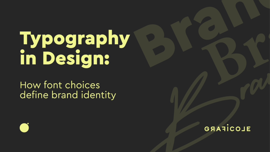
Why Typography Is More Than Just Fonts
Typography is the silent ambassador of your brand. While color and imagery often steal the spotlight, typography shapes how people read, perceive, and emotionally connect with your content. The right font can feel premium, youthful, bold, minimal, or trustworthy—and the wrong one can instantly turn users away.
At Graficole, we believe typography is a critical part of every design decision, whether we’re creating a logo, building a website, or developing full brand systems. Fonts carry tone, rhythm, and intent—and we use them to build powerful brand narratives.
The Role of Typography in Branding
Visual Consistency
Typography ensures uniformity across platforms. A consistent font style across your website, print material, packaging, and social media strengthens brand recognition.
Personality Expression
Fonts have personalities. Serif fonts might feel traditional or elegant. Sans-serif fonts can feel modern and minimal. Script fonts bring flair or luxury. Graficole matches typefaces with your brand’s tone of voice and target audience.
Emotional Influence
Just like color psychology, font choices subconsciously affect how a viewer feels. A startup in fintech might use a bold, geometric font to convey confidence and structure. A yoga studio might use rounded, airy fonts to express calm and openness.
Readability and UX
Typography isn’t just about style—it’s also about function. Fonts that are hard to read frustrate users and reduce retention. We optimize for readability across screen sizes and lighting conditions.
Key Typography Elements We Work With
Font Family
We select combinations of primary and secondary fonts, balancing brand character with legibility. At Graficole, we build custom type hierarchies for every project—headlines, subheadings, body, and captions—often blending Google Fonts with premium or licensed typefaces.
Font Weight and Style
Font weights (light, regular, bold) and styles (italic, uppercase, etc.) help establish rhythm and hierarchy on the page. We use weight variation to create contrast and highlight key information.
Letter Spacing and Line Height
Often overlooked, letter spacing (tracking) and line height (leading) drastically impact readability and aesthetics. We fine-tune these values based on platform (web vs. mobile vs. print) and brand style.
Typography Scale
Graficole creates responsive type scales that adjust naturally across devices, ensuring your message is always legible and well-structured.
Typography in Logo Design
Fonts That Tell a Story
In logo design, typography isn’t just text—it’s a design element. We select or customize typefaces to create distinct, ownable logos that reflect your values.
Examples:
- Luxury brands: High-contrast serifs, elegant spacing
- Tech companies: Clean sans-serifs, geometric forms
- Fashion: Modern grotesque or stylized ligatures
Custom Lettering
For premium branding, Graficole often crafts custom lettering or modifies existing fonts to add uniqueness. A custom “g” or altered “e” can make a logo truly yours.
Versatility
We test logo typography across all use cases—social icons, website headers, business cards, signage—to ensure scalability and clarity.
Typography in Web and App Design
Mobile-First Font Choices
We prioritize legibility on small screens by choosing web-optimized fonts with high x-heights and clean strokes. This ensures clarity without zooming.
Loading Speed
Custom fonts can impact load times. We balance branding needs with performance by compressing font files and using subsets.
Accessibility
Graficole ensures all font choices meet contrast and size requirements for users with visual impairments. Accessibility is built into our design process.
Motion Typography
We integrate subtle text animations—fade-ins, typewriter effects, scroll reveals—to create dynamic storytelling in web and app interfaces.
Explore examples of our web typography work on the Graficole portfolio.
Pairing Fonts for Brand Systems
Primary vs. Secondary Fonts
We typically assign:
- Primary Font: Used for headlines, logo, major brand statements
- Secondary Font: Used for body text, captions, and utility elements
We ensure the two fonts complement each other in tone, size, and rhythm.
Tips for Great Font Pairing
- Contrast is key: Combine serif with sans-serif
- Keep the x-height compatible
- Limit pairings to 2-3 fonts max
- Use a single font family with varied weights for simplicity
Graficole’s Favorite Pairings
- Montserrat + Lora: Modern and elegant
- Inter + Playfair Display: Clean with a touch of luxury
- Poppins + Roboto: Bold, youthful, and functional
Each project’s typography is tailored, but we always test font pairings for usability and branding impact.
Typography for Print and Packaging
High-Resolution Typography
Print design allows for richer details and higher resolution. We carefully select typefaces with crisp vector outlines and strong kerning.
Material-Based Design
Packaging typography must work on different textures—paper, plastic, matte, glossy. Graficole adjusts tracking, size, and contrast depending on print medium.
Layout Balance
We use grid systems and typographic rhythm to make sure text feels aligned and polished—especially for business cards, brochures, and product labels.
Typography Trends in 2025
Brutalist Fonts
Big, blocky fonts with raw edges are trending, especially in fashion, streetwear, and Gen Z-focused brands.
Variable Fonts
One font file, multiple styles. Variable fonts offer performance gains and flexible styling—ideal for responsive web design.
Custom Brand Fonts
More companies are investing in proprietary typefaces to stand out. Graficole can create bespoke fonts that become part of your IP.
Animated Type
Motion typography is no longer a novelty. We use animated type for:
- Loading screens
- Product intros
- Instagram Reels
- Interactive headers
This adds energy and emphasis without compromising clarity.
Typography Mistakes We Help You Avoid
Using Too Many Fonts
Overdesigning with multiple typefaces creates chaos. We limit choices and build clear visual hierarchies.
Bad Kerning
We manually adjust spacing between letters to ensure logos and headlines don’t look awkward or off-balance.
Overused Free Fonts
While Google Fonts are excellent, some (like Lobster or Comic Sans) are overused or outdated. We help you choose typefaces that feel fresh and timeless.
Not Testing on Devices
Fonts may look great on desktop but fall apart on mobile. We QA all typography across platforms and devices before launch.
Typography in Motion Graphics and Video
Graficole brings words to life with motion. We design kinetic typography for:
- Explainer videos
- Social animations
- Brand launches
- Web intros
Using After Effects and Adobe Animate, we create rhythmic, on-brand motion that enhances storytelling.
The Graficole Typography Process
1. Brand Discovery
We understand your tone, voice, audience, and goals before making font decisions.
2. Font Exploration
We research paid and free fonts, explore moodboards, and pitch font pairings aligned with your brand.
3. Testing and Prototyping
We prototype type systems in layouts—logo, web UI, mobile mockups, print templates—before finalizing.
4. Final Delivery
We provide font files, style guides, and web/print assets ready for launch. All fonts are licensed appropriately.
5. Ongoing Support
Typography evolves. We offer seasonal updates, animation extensions, and font customization services as your brand grows.
Final Thoughts: Fonts That Speak for You
Typography is where words meet design. It’s how your message feels—before it’s even read. At Graficole, we turn typography into an extension of your brand identity, carefully crafted and obsessively optimized for clarity, emotion, and recognition.
Whether you’re launching a new brand, redesigning a website, or elevating your visual identity, typography is a powerful design tool—and Graficole is your creative partner in wielding it with intent.