In the competitive world of digital design, where milliseconds determine engagement and conversion rates, visuals aren’t just decoration—they’re strategic tools. At the heart of every high-performing website, landing page, app, or interface is one crucial design principle: visual hierarchy.
Visual hierarchy is the art of organizing content and design elements to guide the viewer’s eye in a deliberate, strategic flow. It determines what users notice first, what they engage with next, and—ultimately—what action they take.
At Graficole, we design with conversion in mind. Whether it’s through intentional typography, structured spacing, contrasting color schemes, or dynamic layout composition, every choice is backed by a purpose—to lead the user down a clear, effective path toward action.
What is Visual Hierarchy in Design?
Visual hierarchy is how design directs the eye. It’s a ranking system of visual importance that subconsciously tells users where to look first, what to read, and where to click. This psychological pattern is driven by size, color, contrast, alignment, repetition, proximity, whitespace, and motion.
It’s not just about beauty—it’s about communication. Without clear hierarchy, users become overwhelmed, confused, or disinterested, leading to drop-offs and missed conversions.
At Graficole, visual hierarchy is the foundation of how we build every design—from full websites to logo systems to interactive UI/UX interfaces. We don’t just design what looks good—we design what works.
Why Visual Hierarchy Impacts Conversion
Imagine walking into a store where the signs are all the same size, there’s no clear path through the aisles, and the promotions are hidden in the corner. Frustrating, right?
Now imagine a digital experience like that. Without hierarchy:
- Calls to action get ignored.
- Important content is missed.
- Users feel overwhelmed and bounce.
Effective hierarchy ensures that:
- Users know where to start.
- They intuitively move through the content.
- They’re nudged toward the next action.
By shaping how users scan and absorb information, hierarchy becomes a silent salesperson—helping to close the deal before a user even realizes it.
The Science Behind How People View Pages
Human eyes don’t move randomly across a page. Studies using eye-tracking software show that users often scan pages in F-patterns or Z-patterns—especially on websites.
- F-pattern: Users scan horizontally across the top, then down the left side.
- Z-pattern: Eyes move left to right, down diagonally, then left to right again.
Graficole’s design team uses these patterns to position key information, CTAs, and visuals where eyes naturally land. Combined with hierarchy, this maximizes information retention and conversion potential.
Key Elements of Visual Hierarchy That Drive Results
1. Size and Scale
Larger elements get noticed first. That’s why headlines are bigger than body text, and CTAs are bolder than paragraphs.
At Graficole, we use size to:
- Emphasize value propositions
- Create impact points
- Direct users from title to CTA naturally
Example: A hero banner with a large, sharp headline followed by a slightly smaller value-driven subtext and a standout button.
2. Typography and Weight
Font choice, boldness, spacing, and case styling all influence where the eye lands.
We design with:
- Strong heading hierarchies (H1, H2, H3)
- Emphasis using bold or italic selectively
- Readable sans-serif fonts for digital use
- Strategic line spacing for easier scanning
Typography alone can increase reading comprehension and decrease bounce rates—a small detail with a big impact.
3. Color and Contrast
Contrast directs attention and communicates priority. A bright button on a muted background screams “click me.” A red alert banner instantly signals importance.
Graficole’s branding and UI/UX teams use:
- High-contrast CTAs
- Brand-aligned accent colors
- Strategic use of white space to isolate key items
We also tap into color psychology to align with emotion and trust. (For more, check out our blog on Color Psychology in Web Design).
4. Spacing and Grouping (Proximity)
When related items are close together, users perceive them as connected. When spaced apart, they’re seen as unrelated.
We design layouts that:
- Use proximity to build logical sections
- Apply margin and padding to enhance flow
- Avoid clutter by spacing out CTAs, visuals, and text blocks
Spacing isn’t just aesthetic—it’s functional organization.
5. Motion and Animation
Microanimations like button hovers, slide-in banners, and loading transitions draw the eye and create engagement loops.
At Graficole, we integrate subtle UI/UX animation to:
- Draw attention to CTAs
- Indicate scroll progress
- Reinforce actions (like “item added to cart”)
These visual cues enhance usability while influencing behavior.
How Graficole Applies Visual Hierarchy Across Projects
Web Design and Landing Pages
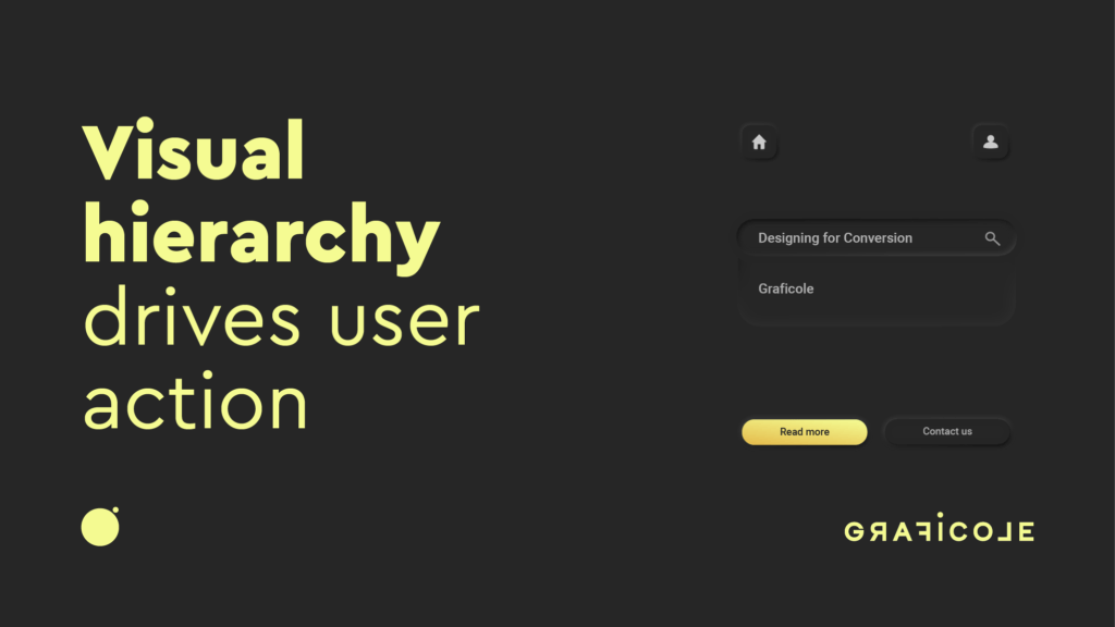
When designing a landing page, the goal is singular: conversion. We create layouts that lead users from curiosity to clarity to conversion through layered hierarchy.
Example:
- Headline (large, bold): Introduces the main value.
- Subheading (medium, light): Builds context.
- Visual cue or icon: Reinforces the message.
- Primary CTA (high contrast, animated): Encourages click.
- Secondary elements (lower opacity): Offer more info without distraction.
Each component builds on the next, like steps in a staircase toward action.
Explore our approach on the Graficole Web Design Services page.
Branding and Logo Design
Even a logo contains visual hierarchy—through color contrast, symbol vs. type placement, and balance.
Our logo designs reflect:
- Scalability (can be read at any size)
- Emphasis on brand essence (icon or wordmark?)
- Simplicity for memorability
- Versatile use across digital and print
Great branding starts with structured visual communication.
Social Media Content
In social visuals, hierarchy must work in under two seconds. We structure social content using:
- Contrasting titles
- Layered elements
- Eye-catching color gradients
- Icons or motion overlays
From carousel design to Reels covers, Graficole helps brands stand out in the scroll.
Real Results: A Client Story
A SaaS client came to Graficole with a high bounce rate and low conversion on their product page. Their issue? No visual hierarchy—just blocks of equal-sized text and vague CTAs.
We redesigned the layout to:
- Emphasize the product benefit with larger H1 headers
- Highlight testimonials in bold, bordered sections
- Create CTA buttons with vibrant color and hover animation
- Use white space to draw focus to key features
Within 60 days:
- Time on page increased by 42%
- Bounce rate dropped by 35%
- Conversions doubled
The solution wasn’t more content—it was better hierarchy.
Tools and Frameworks We Use at Graficole
- Figma & Adobe XD: For wireframing hierarchy before building.
- Heatmaps: To test where users naturally click or pause.
- Accessibility testing: To ensure contrast ratios meet WCAG standards.
- A/B testing: To validate which hierarchy designs convert best.
Every design is tested, refined, and delivered with purpose.
Mistakes to Avoid in Visual Hierarchy
- Too many focal points: Leads to user confusion.
- Lack of contrast: Makes everything blend into noise.
- Ignoring mobile hierarchy: Mobile screens need even tighter structure.
- Decorative overload: Overuse of gradients, shadows, and animations can dilute clarity.
At Graficole, we follow a mantra: if it doesn’t guide the user, it doesn’t belong.
Visual Hierarchy and Accessibility
Designing for conversion must include inclusive experiences. We ensure hierarchy is preserved for:
- Screen readers (semantic HTML structure)
- Colorblind users (using symbols and size, not just color)
- Mobile users (responsive scaling and tap-friendly CTA placement)
Good hierarchy serves everyone.
Final Thoughts: Design That Moves People
Visual hierarchy is more than a layout choice—it’s a conversion strategy. By guiding the eye, calming the mind, and motivating the click, visual hierarchy turns design into business results.
At Graficole, we don’t leave user journeys to chance. We craft every interface, layout, and brand asset with intentional hierarchy that leads to real engagement and measurable growth.
Want to convert more users with visual design that works?
Let’s design your next high-performing experience.